Parent properity
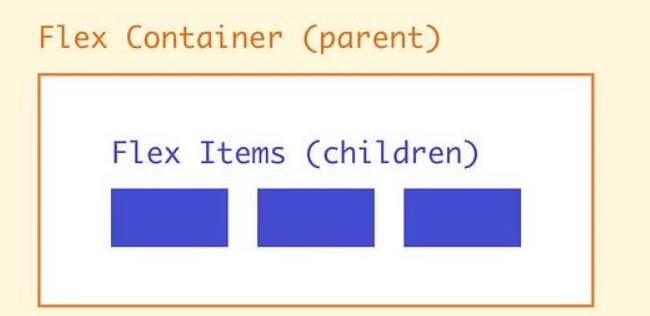
As we mentioned before ,In the context of Flexbox, a “parent” element is a flex container, and “child” elements are the flex items within the container.
The parent element uses the Flexbox properties to control the layout of the child elements.
Now, Sara started creating a flex container for the list of products.
She used the display: flex property in the CSS for the container element to turn it into a flex container:
.products {
  display: flex;
}
Next, Sara added a few child elements to the container, each representing a different product.
She used the flex-direction property to control the direction in which the child elements were laid out:
.products {
  display: flex;
  flex-direction: row;
}

@media (max-width: 600px) {
  .products {
    flex-direction: column;
  }
}
On large screens, the flex-direction was set to row, which caused the child elements to be laid out in a row from left to right.
On small screens, the flex-direction was set to column, which caused the child elements to be laid out in a column from top to bottom.
Complete the lesson to know more about properties for parents sara may use to create to make the client ‘s website more responsive 😉